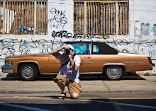
I can send in five entries, but I'm very torn about one in particular. I have two slightly different versions of the same subject and I can't decide which one is a better photograph. Please let me know which you prefer and why. Extra credit points given for originality and creativity. If you actually hate both, I suppose you can tell me that as well, but don't expect extra credit for it. Neither one is perfect--wish I had a third version--but I love the "idea" of the image if that makes any sense. Thanks in advance for your help.


2 comments:
Hmm. I'm torn, too, as I tend to like the fact that the second one only has the "archi-tecte" text on it, but I don't like its vertical centering. As to the first, I don't think the "E. Goss" text adds anything, but I feel like the composition is better. In the end, I vote for Version 1, but it's close.
--borglum
You have the same reaction I did, only more eloquently put. Thanks for the help.
Post a Comment