Tuesday, July 15, 2008
Updated Website
For the relief of my ones of fans out there, I just wanted to finally announce the arrival of my newly updated webpage and new galleries of images. It has been a long time coming. Please let me know what you think of the photographs there. Thanks and take care.
Monday, June 2, 2008
Best of West Virginia
There is another Tamarack show coming up, running from June 20th to August 3rd. It will be a great show, so if you are within driving distance I strongly urge you to go, if only to see my two pieces in the show, heh.
Here are the two pieces that were accepted (you have seen them in earlier posts, but see if you can find the subtle photoshop work I did on the first one):

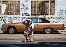
Final Architecture

Smiley
Frankly I was surprised that those were the two they chose from the five entries because I thought the other three were stronger. I guess that's why I'm an entrant and not a member of the jurying body. Here are the three rejects. Let me know what you think. I'm especially happy with the Duke!

The Shape of Color

The Color of Shape

The Duke in the John
Here are the two pieces that were accepted (you have seen them in earlier posts, but see if you can find the subtle photoshop work I did on the first one):


Frankly I was surprised that those were the two they chose from the five entries because I thought the other three were stronger. I guess that's why I'm an entrant and not a member of the jurying body. Here are the three rejects. Let me know what you think. I'm especially happy with the Duke!


Tuesday, April 22, 2008
Final Architecture
While I'd planned a more substantive post, life has again taken precedence, so I'm instead coming to you with a plea for your help. I'm trying to put together entries for a new juried show at Tamarack coming up this summer called "The Best of West Virginia."
I can send in five entries, but I'm very torn about one in particular. I have two slightly different versions of the same subject and I can't decide which one is a better photograph. Please let me know which you prefer and why. Extra credit points given for originality and creativity. If you actually hate both, I suppose you can tell me that as well, but don't expect extra credit for it. Neither one is perfect--wish I had a third version--but I love the "idea" of the image if that makes any sense. Thanks in advance for your help.

Version 1

Version 2
I can send in five entries, but I'm very torn about one in particular. I have two slightly different versions of the same subject and I can't decide which one is a better photograph. Please let me know which you prefer and why. Extra credit points given for originality and creativity. If you actually hate both, I suppose you can tell me that as well, but don't expect extra credit for it. Neither one is perfect--wish I had a third version--but I love the "idea" of the image if that makes any sense. Thanks in advance for your help.


Friday, April 11, 2008
66th Biennial AAWV Juried Exhibition '08
Wow, it's been a while. I won't bore you with excuses for the long absence. Just life getting in the way of the important stuff. As a way to get back on track, though, I have good news to post. I just found out that all three of my entries to the 66th biennial Allied Artists of West Virginia Juried Exhibition were accepted. The show opens May 24th at the Huntington Museum of Art and will run through the end of June. There has been some controversy because the judge only accepted 30 pieces for the show, resulting in a much smaller collection than in the past. This show has always been good, though, so I'm looking forward to seeing what it will be like this year. Anyway, here are the three photographs of mine that were chosen. They were all taken on the road trip Dawn and I took down to Florida last Thanksgiving. Hope if you are close by, you can stop by and see the show!

Blue Waltz

Spigot

Text & Subtext


Thursday, December 6, 2007
Modern Interpretations Show
Sorry for the long absence, but it's been a hectic fall. We just got back from a FL thanksgiving and I hope to have some pictures up from it soon. Until then, I thought I'd share the good news with you about a new show.
I just found out I had two pieces accepted to a new show at Tamarack called "Modern Interpretations" which runs from January 13th through March 16th, 2008. I can't say enough for the work Karen Lilly, the gallery director at Tamarack, has done to help create a wonderful showcase for West Virginia Artists.
I had a tough time choosing what to submit because I couldn't decide which of my pieces had "modern" sensibilities. Obviously, such a concept as modernity is subject to many interpretations, so I'm still not sure what the jurors used to make their decisions (and won't until I see the whole show), but after much agonizing, here are the pieces I submitted:

Any Questions? Through the Looking Glass Blevio The Shape of Color The Story of Tomorrow
I just found out I had two pieces accepted to a new show at Tamarack called "Modern Interpretations" which runs from January 13th through March 16th, 2008. I can't say enough for the work Karen Lilly, the gallery director at Tamarack, has done to help create a wonderful showcase for West Virginia Artists.
I had a tough time choosing what to submit because I couldn't decide which of my pieces had "modern" sensibilities. Obviously, such a concept as modernity is subject to many interpretations, so I'm still not sure what the jurors used to make their decisions (and won't until I see the whole show), but after much agonizing, here are the pieces I submitted:


These were the two images chosen for inclusion. The three that didn't get accepted follow:


I'm not sure what separates out the first two, but it was a very fun exercise--well fun in retrospect--to struggle with what what modernity means when it comes to photography, a rather modern art form to begin with. I'd love to hear any thoughts on the photos themselves or modernity in art generally. Take care and thanks for the interest.
RAV
Wednesday, September 5, 2007
Finding the Words
Considering I've taught college writing and literature classes for over 15 years, it's not surprising that I find myself fascinated with language. Switching my focus to photography hasn't lessened that interest, so it shouldn't come as a shock that the second photographic series I'd like to talk about is something I'll call "Finding the Words." One of my favorite photographic subjects is the written word, whether that word be printed on a business sign or scrawled hurriedly on an alley wall. In the following entry I'll provide examples of both these types of found words and discuss the photographic relevance of these instances of visible language.
Looking for Signs
First I'd like to tackle the example of what I'll call official words, words that are printed up and serve an official, socially sanctioned, function, usually for businesses.
Here are some examples:

Onan Motors

Moving Prosthetics

Law and Order

Christian Porn
First, let me explain why I felt compelled to capture these words with my camera. In the first image, I felt an admittedly juvenile pleasure in seeing Onan--the biblical figure best know for spilling his seed and thereby associating his name to masturbation--selling engines. At least he doesn't have to worry about his idle hands any more.
The second photo was similarly motivated by a childish sense of humor. If you look carefully at the two signs on the building, one labels it as the home of Carolina Orthotics and Prosthetics. The other sign indicates that it is actually the *former* home of the company as they have moved. I found this an odd juxtaposition, a symbol of limited mobility being on the move.
The third image was taken on a Manhattan tour boat. The axe implies how serious they are about being orderly. They will enforce that rule, but it might not be clean or painless seems to be the implicit message.
The last photo was taken in Jefferson, WV, infamous for it's adult industries. I couldn't pass up the chance to capture the odd pairing of adult bookstore and evangelical church. I suppose it could provide convenience for those wanting to sin and then be forgiven immediately.
Obviously what ties all of these images together is the humor that arises from the words and their surroundings, text and context if you will. The level and quality of the irony that arises from these juxtapositions is certainly of different values in these photos. The simple, adolescent humor of the first two images for example isn't nearly as complex or interesting as the ironic pairings of the second two images that require a little more work on the viewer's/reader's part to work out. Ultimately, though, wherever these images fall on that continuum, it is this type of juxtaposition, this ironic misconnect, that draws my interest both linquistically and photographically.
The Writing on the Wall
The second type of found-word image I like to capture is graffiti. This is a much more subversive form of visible language that is usually left by the lone individual, perhaps an artist in his or her own right, without official sanction of any sort.
Here are some examples:

Corporate Biatch

Muff Graffiti

The Tombs Have Eyes
Now, these pictures don't have the same type of subversive irony that the official signs did since they are subversive on their surface, written furtively in places not originally intended for these words. Instead, an individual felt moved to make a public statement in written form. Therefore, the content of these found words carry more weight than their context for the most part.
What drew me to the first image--taken at a bus stop in Geneva, Switzerland--was perhaps another burst of adolescent immaturity. I liked the implicitely serious questioning of a very fundamental social institution, one that undergirds modern, Western capitalism--a very weighty topic--combined with the playful street slang of Biatch. Certainly this is another form of ironic conjoinment, but in this case, it is one that the author him/herself did, whether deliberately or by accident.
In the second image found in Youngstown, OH, I'm intrigued by the hastily scrawled warning to keep our hands off that boy's muff. Reading through the possible definitions for that term provided by the link, I will let you make up your own mind as to the writer's intentions. It seemed like such a random warning and yet implying such immediacy, earnestness, and specificity--not just any boy, but *that* boy--that there was another disconnect in my experience of these found words.
In the final photograph, found at a cemetery in Paris, France, are words painted on the back of a sign which translate into English as "The tombs have eyes." Now I know that the French have a fascination with and acceptance of death that we in the United States do not. When I was visiting the graveyard, for example, there were many Parisian families having picnics, enjoying the green space. Even by this standard though, this phrase was very eerie. It recontextualized the tombs for me and indeed I felt the subject of their gaze as much as they were the subject of mine. I wanted to photograph this moment of insight someone had taken the time to leave behind.
Yeah, but is it art?
Now, I have described my fascination with the found word, both official and subversive, and why I feel compelled to capture these images. However, the question remains, if I am to set about making a series of these photos, is this visible language photo worthy? If I claim to be a fine arts photography, are these images worthy of the name fine art? Needless to say, this is a very prickly question that deserves much more attention than I am prepared to give it now, but I think it ultimately boils down to the question of whether these photos have the visual aesthetics to stand as art or instead is their true impact primarily verbal. And if that is the case, does it mean that they cannot stand on their own as visual artifacts. In other words, could these photos still have value as photographs without the viewer being able to understand their verbal messages. If someone didn't read English, would they still be worth viewing, would they still "mean"? And if the answer to that is no, does that necessitate that the images aren't valuable as fine arts photography?
I think that the picture I've presented in this entry show that actually there is a spectrum from one of these extremes to another. For instance, the Moving Prosthetics image doesn't really have any visual interest other than the signs. Without that, the picture doesn't hold up on a purely visual level. However, the Muff Graffiti picture I think does work on a visual level with the dynamic movement of the hastily scrawled warning. To state it simply, some of these images are more aesthetically pleasing than others.
Obviously, this entry has gone on far too long already, so I'll leave related questions for my next entry. I am curious for now though what you think about these images. Are they worth pursuing as a series, or is their impact limited and just good for a laugh. Thanks for your interest. Take care.
RAV
Looking for Signs
First I'd like to tackle the example of what I'll call official words, words that are printed up and serve an official, socially sanctioned, function, usually for businesses.
Here are some examples:


First, let me explain why I felt compelled to capture these words with my camera. In the first image, I felt an admittedly juvenile pleasure in seeing Onan--the biblical figure best know for spilling his seed and thereby associating his name to masturbation--selling engines. At least he doesn't have to worry about his idle hands any more.
The second photo was similarly motivated by a childish sense of humor. If you look carefully at the two signs on the building, one labels it as the home of Carolina Orthotics and Prosthetics. The other sign indicates that it is actually the *former* home of the company as they have moved. I found this an odd juxtaposition, a symbol of limited mobility being on the move.
The third image was taken on a Manhattan tour boat. The axe implies how serious they are about being orderly. They will enforce that rule, but it might not be clean or painless seems to be the implicit message.
The last photo was taken in Jefferson, WV, infamous for it's adult industries. I couldn't pass up the chance to capture the odd pairing of adult bookstore and evangelical church. I suppose it could provide convenience for those wanting to sin and then be forgiven immediately.
Obviously what ties all of these images together is the humor that arises from the words and their surroundings, text and context if you will. The level and quality of the irony that arises from these juxtapositions is certainly of different values in these photos. The simple, adolescent humor of the first two images for example isn't nearly as complex or interesting as the ironic pairings of the second two images that require a little more work on the viewer's/reader's part to work out. Ultimately, though, wherever these images fall on that continuum, it is this type of juxtaposition, this ironic misconnect, that draws my interest both linquistically and photographically.
The Writing on the Wall
The second type of found-word image I like to capture is graffiti. This is a much more subversive form of visible language that is usually left by the lone individual, perhaps an artist in his or her own right, without official sanction of any sort.
Here are some examples:


Now, these pictures don't have the same type of subversive irony that the official signs did since they are subversive on their surface, written furtively in places not originally intended for these words. Instead, an individual felt moved to make a public statement in written form. Therefore, the content of these found words carry more weight than their context for the most part.
What drew me to the first image--taken at a bus stop in Geneva, Switzerland--was perhaps another burst of adolescent immaturity. I liked the implicitely serious questioning of a very fundamental social institution, one that undergirds modern, Western capitalism--a very weighty topic--combined with the playful street slang of Biatch. Certainly this is another form of ironic conjoinment, but in this case, it is one that the author him/herself did, whether deliberately or by accident.
In the second image found in Youngstown, OH, I'm intrigued by the hastily scrawled warning to keep our hands off that boy's muff. Reading through the possible definitions for that term provided by the link, I will let you make up your own mind as to the writer's intentions. It seemed like such a random warning and yet implying such immediacy, earnestness, and specificity--not just any boy, but *that* boy--that there was another disconnect in my experience of these found words.
In the final photograph, found at a cemetery in Paris, France, are words painted on the back of a sign which translate into English as "The tombs have eyes." Now I know that the French have a fascination with and acceptance of death that we in the United States do not. When I was visiting the graveyard, for example, there were many Parisian families having picnics, enjoying the green space. Even by this standard though, this phrase was very eerie. It recontextualized the tombs for me and indeed I felt the subject of their gaze as much as they were the subject of mine. I wanted to photograph this moment of insight someone had taken the time to leave behind.
Yeah, but is it art?
Now, I have described my fascination with the found word, both official and subversive, and why I feel compelled to capture these images. However, the question remains, if I am to set about making a series of these photos, is this visible language photo worthy? If I claim to be a fine arts photography, are these images worthy of the name fine art? Needless to say, this is a very prickly question that deserves much more attention than I am prepared to give it now, but I think it ultimately boils down to the question of whether these photos have the visual aesthetics to stand as art or instead is their true impact primarily verbal. And if that is the case, does it mean that they cannot stand on their own as visual artifacts. In other words, could these photos still have value as photographs without the viewer being able to understand their verbal messages. If someone didn't read English, would they still be worth viewing, would they still "mean"? And if the answer to that is no, does that necessitate that the images aren't valuable as fine arts photography?
I think that the picture I've presented in this entry show that actually there is a spectrum from one of these extremes to another. For instance, the Moving Prosthetics image doesn't really have any visual interest other than the signs. Without that, the picture doesn't hold up on a purely visual level. However, the Muff Graffiti picture I think does work on a visual level with the dynamic movement of the hastily scrawled warning. To state it simply, some of these images are more aesthetically pleasing than others.
Obviously, this entry has gone on far too long already, so I'll leave related questions for my next entry. I am curious for now though what you think about these images. Are they worth pursuing as a series, or is their impact limited and just good for a laugh. Thanks for your interest. Take care.
RAV
Monday, August 6, 2007
First in a Series
Years ago, when I was first getting serious about photography, Dawn and I visited Savannah, GA, and fell in love with SCAD, Savannah College of Art and Design. The way they have revived downtown by placing the school in abandoned buildings is very inspiring. While touring the school, I was lucky enough to meet with the chair of the photography department. When I returned home, I sent him a link to my website and asked him what I could do to improve my chances to be accepted to the MFA program. He very generously took time to look at my "portfolio"--it hardly deserved such a professional title--and gave me some advice. He said study other photographers to understand the field as it currently existed and to think beyond the single shot. He said I had a "good eye"--a nice way of saying I was a hobbyist still--but ultimately just had a bunch of snapshots. To really move forward and grow as a photographer, he told me I needed to develop ideas for series of connected images.
Needless to say, this was disappointing to a self-deluded photographer who just wanted to hear that I didn't need to apply to SCAD since my talent was so self-evident. I would be accepted without question. However, after the sting wore off, I realized he made a lot of sense. I certainly had a few themes that I was drawn to--see earlier posts for examples--but had never started with an idea first and then took pictures to embody that idea. I had always worked the other way around, just taking photos of things I responded to viscerally and afterward trying to see a narrative that connected them together.
Over the ensuing years, as I've developed as a photographer and artist, I've been thinking about Ideas and what would make a good series and have come up with a few possibilities. I wanted to take this entry to sketch out one such series. It is still very fuzzy in my head and so would love to get any feedback from you.
Food. I'm fascinated with food. Not only the consumption of it--I love to cook, love to eat--but also the ways in which it gets commodified in our culture. Needless to say, our relationship to food in the United States is different than a society that doesn't have such abundance. Only in an industrialized, rich country, for example, could food literally be a toy.
Food is a complicated commodity though because it's not just a sign of wealth or prestige, but is essential to life. Unlike most consumer items, food is actually consumed. The bare nutritive value of it gets repackaged in a variety of ways though according to social and cultural values. I'm fascinated with how we package and sell this essential item. The various brands of foodstuffs stacked on grocery store shelves have roughly the same nutrient value, no matter what brand. So what stimulates the competition for sales required in a capitalist food culture? Primarily, it's a graphical battle. The artistic design that goes into creating the labels marks the food as creating its value to consumers through how well it calls to the eye on the shelf as a graphical abstraction separate from its nutritive value. In some ways, this is a topic already well explored by the likes of Andy Warhol in his famous Campbell soup can pieces.

However, grocery stores are not the only gathering places for food in our culture. I'm also fascinated with the visual aspect of food when it is presented in restaurants. The visible markers that go into differentiating a fast food lunch at McDonald's--the paper wrappers, paper cups, and colorful cardboard containers--from a fancy dinner at a gourmet bistro--flowers and candles on the table, china, a garnish on the plate. It is a feast for the eye as well as the belly.
I became especially interested in how we interact with the food, as the consumer literally consumes the work of art. My idea was to capture the canvas of the plate *after* the consumer/eater/artist had finished eating. Here are two examples:
Chinese Meal

Mexican Meal

I like these photos because they work abstractly as art with the vibrant colors and swirls and shapes of the emptied plate. However, they also stand as testament to the consumer and the consumed. They represent both the nutritive value of the food as well as its visual impact.
One concern I have about this series is whether it would get too repetitive. Would one emptied plate eventually look just like another emptied plate? However, I think that this would be a problem for any series. If the items are connected through a strong, central, controlling idea, then isn't repetition an inherent danger? Now, I'm aware that this idea for a series isn't fully developed yet, but I remain intrigued by it. What I'm hoping is that you can tell me what you think. Is it worth pursuing? How can I further flesh out the idea behind it? The center pole needs to be strong to keep this tent up. Very curious what people think about this direction for me. If nothing else, I hope I've given you some food for thought. Ha!
RAV
Subscribe to:
Posts (Atom)